


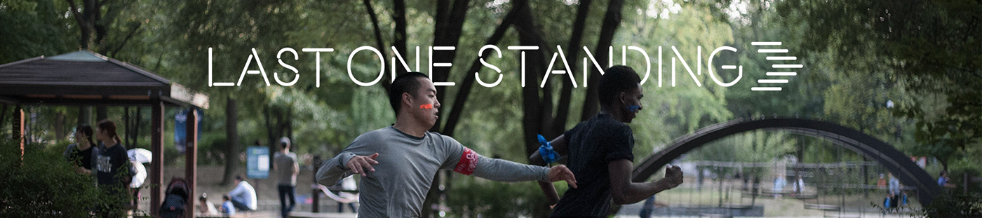
Last One Standing
Art Direction & Brand Design
Last One Standing is the first city-wide, night tag race in Seoul. Runners are split into tribes where they will eliminate each other and occupy territories to win. Last One Standing provides an opportunity for Seoulites to make meaningful connections, escape from their busy lives, and look at Seoul in a different way.

Last One Standing, powered by Lifeventure
We believe that experiences worth more than possessions. We strive to enrich people’s lives by creating exciting and unique experiences that can capture people’s imaginations, realize their dreams and unlock the city’s potential.
Last One Standing is our first curated experience.
Lifeventure, where life is an adventure.


First Iteration of Graphics
The first iteration of graphics depend heavily on simple shapes and icons. It provides a energetic and refreshing vibe to the graphic assets. It is also minimalistic, hence allow the audience to focus key messages delivered in each of the poster. However, the response of the public is lackluster. People wanted to know what it feels like to play before buying the tickets. The graphics have to be more realistic to convey the exhilaration of the gameplay.


Second Iteration of Graphics
The second iteration of graphics made use of realistic pictures to show how would the actual game feel like. Simple taglines, accompanied with photos of exhilarated actions, explain how to play and why should people play the game.
Layering protagonists of each poster in front of the text provide focus and depth to the poster, without compromising minimalism, which the audience appreciates from the first iteration.
First Campaign: How to Play
Explaining how to play the game with three photos with simple, large captions. The realistic photos give the audience the atmosphere of the real game -- Exhilaration, Energy, and Competition.


Second Campaign: 4 Reasons to Play
Another feedback from the first iteration indicates that audience does not know the value of the game. These posters provide 4 value-adds of Last One Standing and align with the brand values of Last One Standing -- Seeing the city differently, joining a community, experiencing something unique, and destressing from daily lives.

Video Trailers
In addition to the posters, trailers are created to introduce the game, illustrate the gameplay and hype up the event. The trailers focus on sleek and exhilaration.
First Iteration of Trailer
The first iteration focuses on the exhilaration of the game. It is fast-paced, simple and exciting. However, the audience found it hard to understand how to play the game.
Second Iteration of Trailer
The second iteration focuses on the story of players in two tribes -- Red and Blue. The red tribe is the catcher, while the blue is the runner. The trailer goes through all the components in the gameplay -- catching, running away from catches, occupying checkpoints -- while retaining the exhilaration captured in the first iteration


